Simple design elements that have hidden meanings!
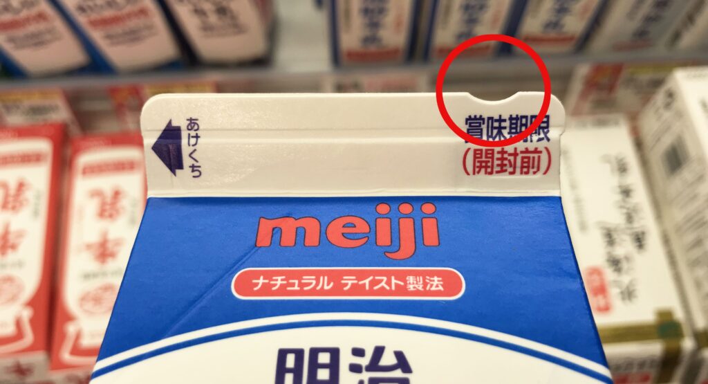
Do you know the meaning of the small, arc-shaped notch on the top of milk cartons? This little gap holds a thoughtful secret. It is designed for the visually impaired so that they can easily distinguish between 100% pure milk and other beverages.
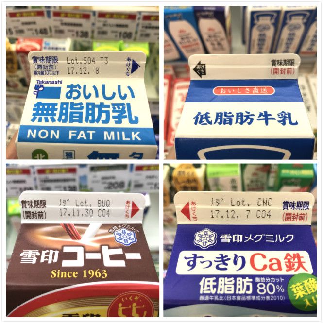
In Japan, only pure milk cartons feature this notch. Other dairy-related products—such as coffee milk, flavored milk, yogurt drinks, or low-fat milk—do not have this mark. By using their sense of touch, visually impaired individuals can quickly identify their desired drink among various similar-sized cartons.
The Story Behind the Notch
The Ministry of Agriculture, Forestry, and Fisheries conducted a survey revealing that visually impaired consumers found it extremely difficult to differentiate between milk and other beverages. In a collaboration between the government and private manufacturers, this arc-shaped gap was placed on the side opposite the carton’s opening. This serves two purposes: it prevents users from buying the wrong product and indicates exactly where the opening is located, ensuring they don’t apply force to the wrong side and cause a spill. It’s a perfect example of “two birds with one stone.”

Universal Design Across Japan
These kinds of details, which make daily life more accessible, are integrated throughout Japan. In 2026, these universal design elements are more prevalent than ever:
Railway Stations: Ticket vending machines, handrails near staircases, and elevators are equipped with instructions in Braille.


ATMs: Most machines now feature tactile buttons and voice guidance to assist users with visual impairments.

These simple design elements are not just useful for the visually challenged but even those of you who cannot read Japanese can benefit from these. At traffic signals, the red button is pressed when you wish to cross the road in order to extend the green light time. This is especially useful for those who have heavy suitcases or luggage.

Did you know you could differentiate between a shampoo and conditioner bottle just by touching it? A bottle of shampoo has raised stripes (textured) on the side while a conditioner does not. So now you know which one to buy in case the labeling is all in Japanese.

In case of canned drinks, those with alcohol also have braille. In case you aren’t sure if something has alcohol, then do check for braille on top of cans.

These are just some of the many design elements that have been incorporated in daily life products and spaces in Japan to make life a little bit easier for the visually and physically challenged. Without a doubt, these small changes have helped improve mobility. When you come to Japan, do remember these and especially on platforms make sure not to walk on the yellow safety line (with textured surfaces) as that is for the visually challenged to find their way in and out of the station.